Basic colour adjustment
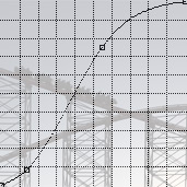
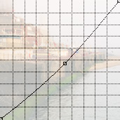
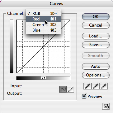
A full discussion of the various ways in which an RGB Curve to be used to manipulate the colour balance of an image is beyond the scope of this tutorial, but in what follows I will show you some of the basic changes you can make using this tool; to either colour correct an image, or alter it for creative effect. In the earlier sections of this tutorial we’ve worked with the RGB Curve to alter the contrast of an image. When you use the Curves tool in this way, while it may affect the saturation, it doesn’t alter the colour balance of an image. To begin to manipulate the colour balance we need to work with the individual colour channels – Red, Green and Blue – rather than the RGB composite. As you can see from the screen-grab opposite, there’s a drop-down menu at the top of the Curves dialog. The first option – RGB – is the one that you’re already familiar with, but there are three further choices: Red, Green and Blue. What these allow you to do is to alter the Curve for a particular colour channel rather than applying the Curve to the image as a whole. What this means is that you can change the colour balance of an image, either marginally – to correct a colour cast, ‘warm’ an image, and so on – or more drastically: to achieve a ‘cross-processed’ look, to dramatically change the colour balance, and so on. The following example should make this a bit clearer:
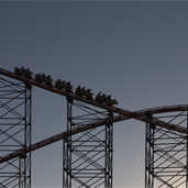
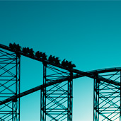
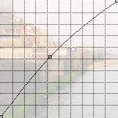
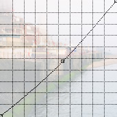
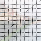
As you can see from the above, the original version of this image was rather dull and flat, and while it isn’t a monochrome image, it certainly isn’t bursting with colour. The first correction I made was to add an S-Curve (set to Luminosity blend mode) to adjust the contrast, followed by some fairly major adjustments to the individual colour channels. If you look at the individual Curves (by hovering over the ‘Red • Green • Blue’ links underneath the third image) you can see that I reduced the amount of red in the mid-tones, and increased the green and blue by roughly the same amounts. This has resulted in the final image having a cyan/turquoise cast. If you’re interested, you can view a higher resolution version of this image here. While the above example demonstrates the ways in which this technique can be employed creatively, it can also be used to colour correct an image. In the following examples I’ve used the Curves in the Red and Blue channels to produce a ‘warmer’ and ‘cooler’ version of a relatively neutral original image, but this technique can also be used when your original image has a colour cast you wish to correct. For example, if you shoot a portrait using a combination of tungsten lighting and fill-flash, you may find that your camera’s automatic white balance will produce an image that’s too warm. This can easily be corrected during RAW processing (assuming that you’re shooting RAW files), but if you’re shooting JPEGs it’s a bit more difficult. Using this technique you can easily change the colour balance of a shot by making a few small changes to the Curve for each channel.
Technical note • setting the colour balance with the eyedropper The ‘auto’ and ‘options’ buttons
Many Curves tutorials begin with a discussion of two features of the Curves tool dialog that I haven’t discussed, and I don’t intend to spend a great deal of time on them now. These are the ‘auto’ and ‘options’ buttons. The reason I haven’t mentioned them before now is that unless you understand the basic principles of tonal range and the way in which the Curves tool works, you won’t understand the changes you make by using them … which isn’t a good thing, even if it does produce a result that you like. What I would suggest is that you play around with the various alternatives that are available through the ‘Options’ button and consult the individual colour channels, in conjunction with the histogram, to see the changes that these options make. Once you understand how these work, they can be useful, but they aren’t something that I’d recommend that you rely on from the outset. Conclusion
My aims with this tutorial were for you to:
If there was anything that wasn’t clear, or you feel that there’s something that I’ve missed out or not covered in sufficient depth, please feel free to leave a comment to that effect (a comment can be left by clicking the comments link at the top of each page). Alternatively, and let me know what you think. Our subscription based tutorials
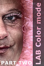
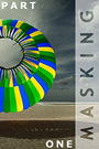
If you enjoyed this tutorial, and would like to learn more about how to use Photoshop to create powerful and compelling images, you might want to take a look at our subscription based tutorials. These build upon the information contained in this tutorial but also cover a broad range of further tools and techniques. Further information regarding our subscriptions is available on the following page: https://www.chromasia.com/tutorials/online/ Alternatively, you can read more about our individual tutorials by clicking on any of the following images:
Index
RSS 2 news feed
David J. Nightingale © 2003–18 • all rights reserved
|
↓ David
↓ Libby
↓ Get the Latest News


software links
 Our annual subscribers and lifetime members can obtain a 15% discount on any of the Topaz Labs Photoshop plugins or plugin bundles.
 Our annual subscribers and lifetime members can obtain a 15% discount on Photomatix Pro.
training partners   Included above are links to a number of our training partners that we unreservedly recommend.
| ||||||||||||||||||||||||||||||||||||||||||||||||||||||||||||||||||||||||||||||||||||||||||||||||||||||||||||||||||||||||||||||