All the entries on chromasia are placed into one of seven primary categories: six to reflect the aspect ratio of the image, and the seventh to indicate that an image isn’t available as a print. Additionally, each photograph may be assigned to one of more additional categories or subcategories, e.g. my travel category, children category, and so on.
The 'digital art' category is for shots that include some substantial alteration to either (or both) the content (the addition of items that weren't in the original shot, or the almalgamation of several images) or appearance of the original(s).
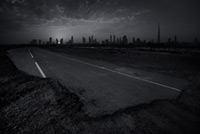
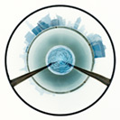
Yes, it's a composite: one shot from Dubai, the other from the Ash Sharqiyah region of Oman, taken during one of mine and Issa's trips to my favourite country in the Middle East. Both the originals are visible when you hover your mouse over the 'Show the Original' link at the bottom right of the image.
| Tweet |
|

|
|
| • 3x2 + travel [Dubai, UAE] + travel [Oman] + digital art + show the original | |||
I'm not sure why, but this feels like a good image for the time of year, so here's wishing you all a great Christmas and a Happy New Year :)

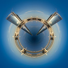
Here's another (pseudo) 'little planet' from Dubai, shot from the rooftop bar of the Four Points by Sheraton on Sheik Zayed Road.

If you'll pardon the pun, here's a slightly different spin on the 'little planet' idea: one constructed from a mirrored copy of an image shot in the Business Bay area of Dubai.

Little Planets are normally constructed from 360 degree panoramas but I thought I'd have a go at producing some from single images. This is the first, produced from a shot taken from the Park Regis hotel in Dubai.
As always, let me know what you think.

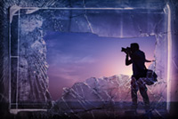
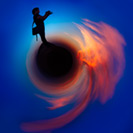
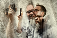
I'm not quite sure I can tell you quite what this one is about beyond the fact that it's a composite of two images: a silhouette of my good friend Issa, shot in the desert near Dubai, overlaid with a broken window near to our office in Blackpool. It doesn't have a great deal of meaning, but it was fun to create :)

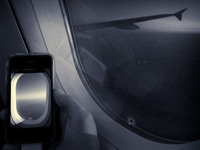
One of the things I talked about during my recent Dramatic Post-Production workshop for Creative Live was the importance of previsualing an image as you take the shot: going beyond how it looks in the viewfinder by imagining how it could look after it's post-produced.
This shot started out in that vein but, as you will have noticed if you've already taken a look at the original, it didn't end there.
When I took the shot I was thinking about creating an image that captured something of the nature of long-haul flying: the long, tedious hours sat in one place, and the various things we do to entertain ourselves en route.
When I looked at the image later though I decided that it wasn't particularly interesting (I'm as bored with looking at Suduko as I am with playing it) so started thinking about what I could have done instead. After playing around with various alternatives I ended up with this image: a photograph of a photograph.
In this case both were taken with my Ricoh GRD III (and the added shot was taken during the same trip, 17 minutes before the main one), then the images were blended in Photoshop. The only thing that was a bit tricky was getting the reflection looking right - I almost forgot to flip it horizontally - but other than that the post-production was relatively straightforward.
As always, let me know what you think.
|
captured camera aperture shutter speed shooting mode exposure bias metering mode ISO flash image quality RAW converter cropped? |
8.06pm on 24/9/2011 Ricoh GR Digital III f/2.4 1/30 aperture priority +1/3 evaluative 100 no RAW ACR yes and no |
| Tweet |
|

|
|
| • 4x3 + digital art + show the original | |||
While I often produce images like this one, well, every once in a while, I rarely post them as I'm frequently dissatisfied with the results. It's rarely a technical problem – I understand the techniques well enough – but more to do with the fact that I lack any clear aesthetic goal(s) when producing them. As such my attempts often end up looking like I layered a random collection of images just for the sake of it ... which never looks good.
Anyway, on this occasion I did have a good idea about what I wanted to say, and how to put the images together, and I'm pleased with how it turned out.
You may have noticed that the 'show the original' link is missing for this one. This isn't because I used multiple images, but because I thought it would be interesting to ask you how many originals you think I used to create it. So feel free to speculate, both about the number of originals, and their content, and let me know.
Finally, if you're interested in learning more about working with textures, take a look at my Working With Textures tutorials (details about part one here and part two here). Both were co-written with Mike Regnier and, if you take a look at either of his websites, you'll see that he's a whole lot better at this than me. Well, most of the time at least ;-)
http://www.regnierstudio.com/
http://regnierphotography.com/
Update: I've now enabled the 'show the original' and, as you can see, I only used two images to create the final version :)


As most of you will know I've been posting the original image with virtually all of my recent entries. In this case though, as the transformation was slightly unusual, I've decided to hold off adding the original until you've had an opportunity to tell me a) what this is, and b) what additional post-production was done to the shot. What I will tell you is that it was shot during my journey from the UK to Bulgaria :)
Update: As Marcel has managed to identify the shot – it's one of the travelators at Manchester airport, warped in post – I've added the 'show the original' link. As you can see, the original is blue, but the perspective is slightly different in this version (courtesy of the warp tool) ;-)
|
captured camera aperture shutter speed shooting mode exposure bias metering mode ISO flash image quality RAW converter cropped? |
10.34pm on 15/10/10 Ricoh GR Digital III f/9.0 2s aperture priority -1/3 evaluative 64 no RAW ACR not telling |
| Tweet |
|

|
|
| • 3x2 + abstract + digital art + show the original | |||

For reasons that I'll explain when I post my next entry, this image marks a transition: a state change, both in terms of what I'll be posting, and the ways in which I want to develop my photography for the foreseeable future. Watch this space :)
As for this one: it's a composite shot of five originals, none of which were sufficiently interesting to post on their own but, when combined, create something that's visually more interesting.
As always, I'd be interested to hear your thoughts.
|
captured camera lens focal length aperture shutter speed shooting mode exposure bias metering mode ISO flash image quality RAW converter cropped? |
1.40pm on 9/3/10 Canon 5D Mark II EF 24-70mm f/2.8L USM 70mm f/4.0 1/320 (or thereabouts) aperture priority -1/3 evaluative 100 no RAW ACR kind of |
| Tweet |
|

|
|
| • 3x2 + digital art | |||
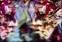
As I was waiting for the guests to arrive at Venice town hall for the wedding I shot a couple of weekends ago I noticed some masks in a shop window. I took a variety of shots, from different angles, but wasn't convinced that any of them would work out as there was quite a bit of glare from the window, and I couldn't really get an angle I was happy with.
That said, I did try processing three of them, all of which are included on the following page:
Unfortunately though, despite the fact that there are some interesting elements in each of the three shots, none of them ended up being worth posting, and I was about to ditch all three when I realised that they might work if I combined them.
In terms of the post-production: first, I combined the three images by stacking them and using Soft Light blend mode and masks to create an image composed of all three originals. I then duplicated and flipped the image, then used another mask to blend this newly created layer with the three images below it. I then warped and altered the colour balance of the left side of the image and increased the overall saturation using the Channel Mixer. I also added some local contrast using the Topaz Adjust plugin.
I don't have a tutorial that covers this sort of montaging technique, at least not specifically, but many of the techniques I used to blend the original images are covered in my Working with textures: part one tutorial.
The end result is an image, in my opinion at least, that's faithful to the spirit of the original scene, but not the reality. As always, let me know what you think.
Oh, and this one works much better with the black theme.
| Tweet |
|

|
|
| • 3x2 + travel [Venice, Italy] + digital art | |||
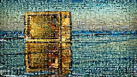
I still haven't managed to get out and shoot any new material so thought I'd post a follow-up to my previous entry, i.e. another mosaic constructed using MacOSaiX. This one is based on one of my favourite beachombing shots, there's nothing on: a shot of an old television that John Washington and I photographed back in 2005.
If you're thinking of trying this process, using either MacOSaiX (for Mac) or AndreaMosaic (for PC), you will probably find that most of your attempts aren't great. For example, I've tried using at least 20 of my own images as the basis for a mosaic, and have only liked two of them, i.e. this one and my previous mosaic portrait. Part of the problem, in my case at least, is that I just don't have enough images to construct a convincing mosaic, at least not without using the same images more than once. As I've been trying to avoid this – by using each of the 1600+ images I've posted on chromasia just once in each mosaic – most of my attempts have ended up looking far too random.
By the same token, I've found that black and white mosaics work best, as each tile just need to be matched to the source image in terms of contrast and content, but not colour. Again, if you have access to a very large number of images, colour matching might work well, but with the images I was playing around with it simply didn't work.
What did work though, at least I think so, is the technique I used for this image, i.e. I superimposed the original image over the top of the mosaic, changed the blend mode to colour, then lowered the opacity to around 75%. The net result is that the contrast and content is determined by the individual tiles while the base image sets the overall colour.
As with my previous entry, I've posted a much larger mosaic here:
http://www.chromasia.com/iblog/archives/theres_nothing_on_mosaic_3000.php
Oh, and in case you're wondering about why this one was cropped to 16x9: I would have preferred to have retained the 3x2 ratio of the original, but the bottom section of the image was rendered last, using images that were far too bright for this area of the image. Again, had I had more images to work with, a 3x2 mosaic would probably have worked well, but just didn't work out in this case.
| Tweet |
|
 "Pin It")
|
|
| • 16x9 + digital art | |||
As I mentioned in my last post I've writing a new book, which is now finished, so it shouldn't be too long until I find some time to shoot some new material. In the short-term though I'm slightly hampered as Libby is currently back in the UK and I have all four of the younger kids and one of the older ones. I should be able to find some time - in between referring, cooking, shopping, and so on, but it's likely to be limited.
I'm also slightly hampered by the fact that my 1Ds Mark II is broken (though I still have my 5D). I was shooting some material for the book, on 1st and 2nd curtain sync, and the shutter broke. If you take a look at the following url you will see that one of the shutter blades has become detached:
http://www.chromasia.com/misc/shutter.jpg
In other words, it's going to need a new shutter which I'll sort out next time I'm back in the UK. In the meanwhile though Libby is picking up a Canon 5D Mark II which she'll bring back next weekend. I've thought about getting one for ages, but haven't been able to justify the expense, so thought this would be as good a time as any :)
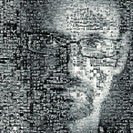
All of which leaves us with this image. It was constructed with MacOSaiX, from 1600 of the 1644 images that have been posted on chromasia, and used a portrait of me as the base image. The portrait was shot by my good friend Bobbi Lane, and is the one I use for my profile pic on Facebook and Twitter.
At this resolution it's a bit difficult to tell what you're looking at, so I've posted a bigger version here:
http://www.chromasia.com/iblog/archives/mosaic_portrait.php
If you do take a look, it will take some time to load as it's 3000px square and 2.8MB. The base image is included at the bottom-right of the mosaic. I can't imagine that this is a technique I'll be repeating, but it was fun to put this one together.
On an unrelated matter: my good friend Adam Swords has just launched his new website. If you haven't already done so, take a look:
| Tweet |
|

|
|
| • 1x1 + people [portraiture] + digital art + self-portrait | |||
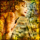
Having written two tutorials on the topic of working with textures (details about part one are here, part two here) I thought it was about time that I posted something that used the techniques. And while I'm reasonably pleased with how this one turned out it would definitely be fair to say that this is a technique that I understand more from a technical point of view than I do from an artistic one; i.e. I can do it, but am still struggling a bit with working out the aesthetics for this type of image. What I can say though is that they're a lot of fun to produce.
If you're interested, the base image is here:
On a related matter: we're currently running a 4th of July special offer on our tutorials and are offering a 25% discount on the first year's payment of an annual subscription or our lifetime membership package. If you're interested there are some further details here:
http://www.chromasia.com/tutorials/online/
Update: if you missed our 4th of July promotion, don't worry, we're still offering a 15% discount until the end of July :-)
| Tweet |
|

|
|
| • 1x1 + children [portraits] + digital art | |||
There was a great line up of photographers at this year's GPP training event – Joe McNally, David Hobby, Drew Gardner, Vincent LaForet, Zack Arias, Carol Dragon, Chase Jarvis, Cliff Mautner, Asim Rafiqui, Chris Hurtt, Bobbi Lane, and Robin Nichols – and while I'd met many of them at last year's event, there were a few new faces this time round.
One of the newbies was Zack Arias, the (multiple) subject of this shot. If you're not familiar with his work, take a look at his website, and be sure to check out a video I linked in a previous post – Transformed – it's a great piece of work. You might also want to check out his OneLight DVD. I'm just working my way through it at the moment and would definitely recommend it if you need any help/inspiration on how to use a single strobe to light your subjects.
As for this image: I didn't set out to produce a composite portrait, but was shooting Zack in the Souk as he was filming with his Flip Mino. I didn't think that any of them would be especially great (I was snapping rather than thinking about what I was doing), but when I looked through them I realised that while none of the individual shots were particularly good, they might work well as a set. Part of the reason I was prompted to think of a composite image was because Zack shot the group portrait at GPP this year using a single strobe to light 29 people dotted around a dark auditorium - one by one. If you're interested, the final image and Zack's description of the process are here:
As always, let me know what you think.

First of all, thanks for all the comments on my last post. I know that HDR images aren't everyone's cup of tea so it was good to see that it was well received.
On the subject of HDR images, Craig posted an HDR portrait of me a couple of days ago. In terms of technique, I think it was pretty well done, but the content leaves a bit to be desired. Mind you, I really hate seeing photographs of myself – there's just something really odd about the whole experience :-)
On a different matter, and related to this image, I just posted our latest tutorial – Working with textures: part one. I'm particularly pleased with this one, not least because I used some of Mike Regnier's work to illustrate the tutorial in addition to a couple of my own. If you're not familiar with Mike's work then you really should pay his site a visit – he's a genius when it comes to working with textures.
Anyway, having said all that ...
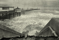
This one combines one original image and two textures: a shot of the North Pier, another of a ripped canvas blind, and another of a water stain on a wall. It's not quite up to Mike's standard, but I'm pretty pleased with how it turned out.
As always, let me know what you think, even if it's only to tell me that you don't like it :)
| Tweet |
|

|
|
| • 3x2 + piers [North pier] + fylde coast [scenic] + digital art | |||
This is a follow up to the one I posted the other day, and I thought I'd try something different with this one.
One of the techniques that I understand in principle is how to layer textures into an image, but I don't yet feel as though I have much of an aesthetic grasp of how the final image should look. For example, I think that this one is interesting, and I did have a vague idea about using the textures to add a rain-like effect to the sky, but it seems to have ended up looking a bit more random than I intended.
It is a technique I'm working on though, as I'm planning on releasing a tutorial on this topic in mid December. Because I'm less familiar with this topic than some of the others I've written about, and because I think it will be an interesting and rewarding experience, I'm co-writing it with Mike Regnier. If you take a look at his website – linked below – you will see that he's a definite master at this technique:
http://www.regnierphotography.com
|
captured camera lens focal length aperture shutter speed shooting mode exposure bias metering mode ISO flash image quality RAW converter cropped? |
3.19pm on 4/11/08 Canon 1Ds Mark II EF 24-70mm f/2.8L USM 45mm f/5.6 1/60 aperture priority +1/3 evaluative 100 no RAW ACR minor |
| Tweet |
|

|
|
| • 3x2 + fylde coast [scenic] + digital art | |||
While a lot of my images are quite heavily processed it's rare that I combine images, not because I think there's anything wrong with doing so, but because I find it difficult to achieve an end result that I like. For example, I would love to be able to produce the sort of images that Mike Regnier creates, and while I do understand the process, I find that my attempts often fall short of what I would like to achieve.
In this case though I'm relatively pleased with the end result which was constructed from two originals – a shot of a mannequin, and another of a wall – both of which can be seen here:
.../archives/fragments_of_you.php
I'll probably produce a tutorial on this topic at some point, but think I need some more practice first :-)
| Tweet |
|

|
|
| • 1x1 + digital art | |||
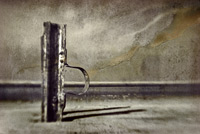
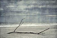
Since I got back from Barcelona I've struggled to take any decent photographs, mostly I think because I'm lacking in inspiration at the moment. So, in an effort to kick-start some creativity, I went up to Fleetwood today with my Lensbaby. Unfortunately though, I didn't get anything I was especially happy with, other than part of this one. And in case it isn't obvious, this is two images - a lensbaby shot of the iron structure on the beach, overlaid by a shot of a cracked wall.
I realise this won't be to everyone's taste, but a) it's different, and b) I really like the how the different points of focus appears to be on different planes; i.e. part of the ironwork, some of the background, and so on.
And I haven't posted the EXIF data, as it isn't really relevant, but the beach shot was taken with the f/8.0 aperture insert.
| Tweet |
|

|
|
| • 3x2 + digital art | |||
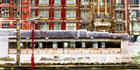
This is a shot of the northern approach to Preston railway station, shot from a train and, as I'm sure you can tell, it owes as much to Photoshop as it does the original photograph. If you're interested, the image was altered by the addition of a V-shaped Curve; i.e. the highlights are reproduced normally, the mid-tones are converted to shadows and the shadows have become highlights. It's an odd effect, not entirely dissimilar to solarisation, and I'm pleased with how it turned out.
As always, and especially since this is a bit of a departure from the stuff I normally post, I'd be interested to hear your thoughts.
|
captured camera lens aperture shutter speed shooting mode exposure bias metering mode ISO flash image quality RAW converter cropped? |
3.07pm on 5/3/08 Canon 1Ds Mark II EF 35mm f/1.4L USM f/2.8 1/85 aperture priority +0.0 evaluative 100 no RAW RAW Developer 2x1 |
| Tweet |
|

|
|
| • 2x1 + digital art + urban | |||


