Introduction to this Photoshop tutorialOf all the tools within Photoshop, the one I use most often, and the one I could least do without, is the Curves tool. It can dramatically enhance the contrast of an otherwise dull image; it can change the colour balance, either subtly or more radically; it can increase the saturation; and it can even covert an image to black and white (when used with LAB color mode). In short, it’s an extremely powerful tool with a wide range of applications; but it’s also quite difficult to understand, at least at first. In this Photoshop tutorial I hope to achieve two things: first, to provide an understanding of some of the basic concepts that underpin the successful application of this tool; and second, to offer a number of practical examples of how this tool can be employed. The topics covered in this tutorial include:
By the end of this tutorial you will:
Please note that I used Photoshop CS2 to construct this tutorial. If you’re using CS3 or above you will notice that the Levels and Curves tool dialogs have changed. The Levels tool, in CS3, 4, 5 and 6 is pretty much identical to its CS2 counterpart – the changes are predominantly cosmetic – but the Curves tool has a number of enhancements including i) a variety of presets for altering contrast and colour balance, ii) a live display of an image’s histogram, iii) the ability to display Channel Overlays, and so on (click here for an example screengrab from CS3 which utilises the ‘Cross Process’ preset). In essence, the CS3, 4, 5 and 6 version doesn’t do anything that can’t be done in CS2, it’s just easier to work with in that it provides more feedback regarding the settings you have applied. The only significant change that was introduced with CS4 is that both tools are now embedded in palettes rather than dialogs. This doesn’t affect their performance in any way, but does save a bit of time in that you don’t need to double click the adjustment layer to see or alter its settings. Understanding tonal range
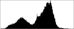
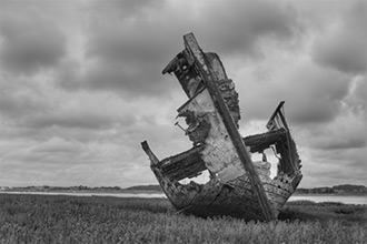
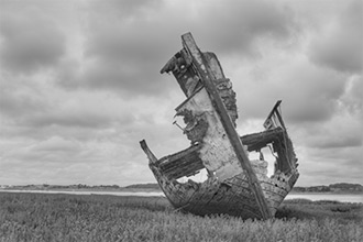
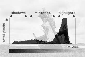
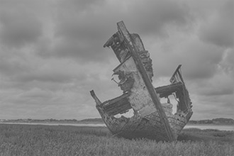
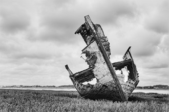
The tonal range of an image, at its most simple, refers to the range of tones between the lightest and darkest areas of an image. For example, an image with a wide tonal range will include both dark and light areas (and a range of tones in between), whereas an image with a narrow tonal range will cover a more restricted range; i.e it may be predominantly composed of mid-tones. The following two images illustrate this point. IMAGE 1, for example, has a very restricted tonal range. If you hover your mouse over the image you can see from the histogram that the tones for this image are bunched in the middle of the range; hence its dull and flat appearance. IMAGE 2, by contrast, has been adjusted using a Curve, and as you can see from its histogram, the tonal range is much wider, greatly improving the image.
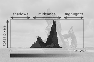
At this stage it’s worth spending a bit of time making sure we understand exactly what a histogram is telling us as it’s an especially useful way of evaluating an image prior to making any changes. We can either use Photoshop’s Histogram to do this (Window → Histogram), or we can use the Levels tool. To use the Levels tool you need to either create a new adjustment layer – Layers → New Adjustment Layer → Levels – or invoke the tool via the image menu – Image → Adjustments → Levels. For an explanation of why it’s better to use an adjustment layer rather than working on the image directly, please see the post-processing note at the bottom of this page.
What you will also notice is that different sections of the histogram vary in height. The height at any given point indicates the number of pixels at a specific level, so, in this instance, we can see that there are two peaks: a smaller one to the left, and a larger one to the right. The one on the left indicates that there are an appreciable number of reasonably dark mid-tones, while the one on the right indicates that there are a higher number of lighter mid-tones. At this stage, the shadows and highlights that we can see in IMAGE 2 are entirely absent from the image. So how do we alter an image using the Levels tool? The easiest way is move the triangular shaped sliders immediately below the histogram. You will notice that there are three of these: a black one on the left, a grey one in the middle, and a white one on the right.
If we now look at the histogram we can see that the tonal range has been considerably increased:
These changes have expanded the tonal range of the image, stretching the dark mid-tones of the original image into the shadow areas of the histogram and the lighter mid-tones into the highlight area. Technical note • painting by numbers As you can see below, IMAGE 3, after this basic Levels adjustment is applied, is considerably better than IMAGE 1 (reproduced below). However, when we compare IMAGE 3 to IMAGE 2 (which was adjusted using the Curves tool), we might decide that our changes have left the image looking a little dark. To lighten the image using the Levels tool we can move the middle slider immediately below the histogram to alter the mid-tones of the image. IMAGE 4 is the result of altering the mid-point to 1.3, and again, this is an improvement over IMAGE 1 but lacks the impact of IMAGE 2.
In this section we have discussed the concept of tonal range and how to change an image’s tonal range using the Levels tool, to alter both the black and white points and the overall brightness of the image using the mid-tones slider. In the remainder of this tutorial we will move on to discuss the Curves tool, a much more powerful and flexible alternative. Post-processing note • why you should always use adjustment layers The second reason is that the more changes you make to an image the more you run the risk of degrading its quality. For example, if you used a Curve to increase the contrast of a black and white image, but later decide that it would look better in colour, you may well decide that you need to decrease the contrast (colour images often require less contrast than black and white images). If you used Image → Adjustments → Curves to increase the contrast of the black and white image, and then use the same technique to decrease the contrast, this will degrade your original image; i.e. it will apply two changes to the image (this will increase any digital noise in your image and, if you’re working with a JPEG, amplify any JPEG artifacts). If, on the other hand, you use the Layer → New Adjustment Layer → Curves option it’s a simple matter of re-opening the Curves dialog and tweaking your original settings, thereby only altering the original image once. David J. Nightingale © 2003–18 • all rights reserved
|
↓ David
↓ Libby
↓ Get the Latest News


software links
 Our annual subscribers and lifetime members can obtain a 15% discount on any of the Topaz Labs Photoshop plugins or plugin bundles.
 Our annual subscribers and lifetime members can obtain a 15% discount on Photomatix Pro.
training partners   Included above are links to a number of our training partners that we unreservedly recommend.
| ||||||||||||||||||||||||||||||||||||||||||||||||||||||||||||||||||||||||||||||||||||||||||||||||||||
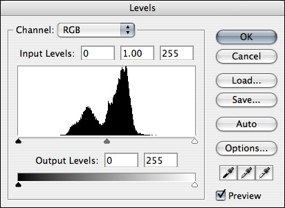 For IMAGE 1, the uncorrected image with a narrow tonal range, we can see that the tones are bunched in the middle of the histogram.
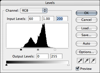 As you move these you will notice that the values in the boxes to the right of the Input Levels label change. For example, if you drag the leftmost slider until it just touches the left edge of the histogram you will see that the leftmost input value changes to 60. Likewise, if you drag the rightmost slider to the left, until it touches the right-hand edge of the histogram, you will see that the rightmost input value changes to 200.