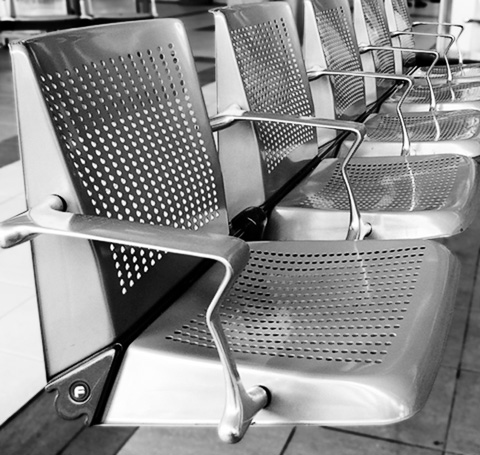
It was mentioned that my previous entry might look more impressive in black and white, hence this entry. I’ve reversed the image, and upped the contrast slightly (it always seems as though reducing an image to monochrome lessens the contrast, at least perceptually) and I’m not really sure whether I prefer it or not. It’s different, obviously, and the image appears to be a little ‘colder’ and perhaps more clinical, but I’m not sure that it’s either better or more impressive.
I’d be intersted in anyone’s comments, not least because I’m planning a series of similar shots (urban/industrial artefacts etc) and would like to adopt a consistent visual theme for the series. Clearly black and white is easy, but I did like the colourised version of this image too.